I don’t think I struggled hugely with the tasks in 3D in terms of completing them however I don’t think the work I produced was as good as some of that as I produced in Fashion and Textiles. I think what I produced was acceptable but I don’t think I pushed myself as much as I could have due to a lack of confidence with 3D design. My feedback for the work I created was positive in that I managed to retain my style throughout the decoration of the structures I made. However, I learnt from the tasks that you must be confident and have no confines in what you create in order to make the most successful and interesting work. We were encouraged to do so but I think a lack of confidence on my part made me quite apprehensive to step out of the basic limits of my 3D abilities. I will use what I have learnt in the future by ensuring that I am confident in what I do and not to worry if things do not work out how I imagine them to. I think the exterior decoration of my structures work well as they convey my style and contain a sense of my personality which distinguishes them. However, I was not happy with the 3D elements of them as they were quite typical and clunky in their design which I think let them down. I found the majority of the 3D week challenging as I was unsure of what I was able to make and so chose quite obvious styles to base my designs on. I can’t say there were any challenges I found easy except possibly the destroying of our structures after testing as I didn't really have much attachment to what I had created. My methods of planning could have definitely been improved as I didn't really think about what I was making or have any considered ideas for the structures which I would never do in any other creative task. This was encouraged however I don’t think it worked particularly well for me due to a lack of knowledge and experience in the subject. I did learn however that there will be tasks that you struggle with and do not work out how you would like but it is important to know that sometimes you must recognise your strengths and know what you are good at.
Monday, 30 September 2013
Sunday, 29 September 2013
Day 3-3D design


 |
| the view from my work space |


 |
| the mini 02 |
 |
| spaghetti man with my structure |

 |
| the aftermath of the basketball testing |
my structure is at 0.16
Contextual studies: Tine Bech lecture
Today we had the second of our contextual studies lecture featuring a visual artist that specialised in interactive design and public art called Tine Bech (http://www.tinebech.com). She talked us through a selecion of projects she had completed including a project involving a spotlight that moved and changed colours as humans interacted with it. She then also discussed another project which explored interaction and play in relation to sound using the medium of wearable capes. It was interesting to hear from someone in a completely different field in comparison to last week's lecture. I also found it interestig in the way she used technology as another medium as opposed to letting it dominate her practise. A big message she pushed in the lecture was the importance of play and revealed that it sculpts the brain as the neurons are active. This means the brain is better at adapting; I found this interesting as I think my work contains quite a playful feel to it and through my use of unusual childlike media, rejects the formalities of maturity in art.
Day 2-3D Design
 |
| The O2 on a foggy morning-on the way to college |


Today was the second day of the 3D exploratory stage and was focused around the creation of bridges. We began by creating a few mini bridges using paper and pritt stick as a warm up exercise. The pictures can be seen below:

The next stage of the day was to collaborate on the creation of a bridge that could hold the weight of a remote control car. Another criteria was that a table (a fake boat) had to go under the bridge and so we decided to make a draw bridge type structure. This was a very difficult challenge as our ideas seemed to fail consistently to begin with. However, we managed to keep going and actually create a bridge that had both the draw bridge feature and was able to hold the weight of the remote control car. We also decided to accessorise our bridge with a sign stating 'We tried' made from glitter despite a reluctance from our tutor Geoff in using glitter and sequins. Below are photos of our bridge, its creation and videos of the testing:
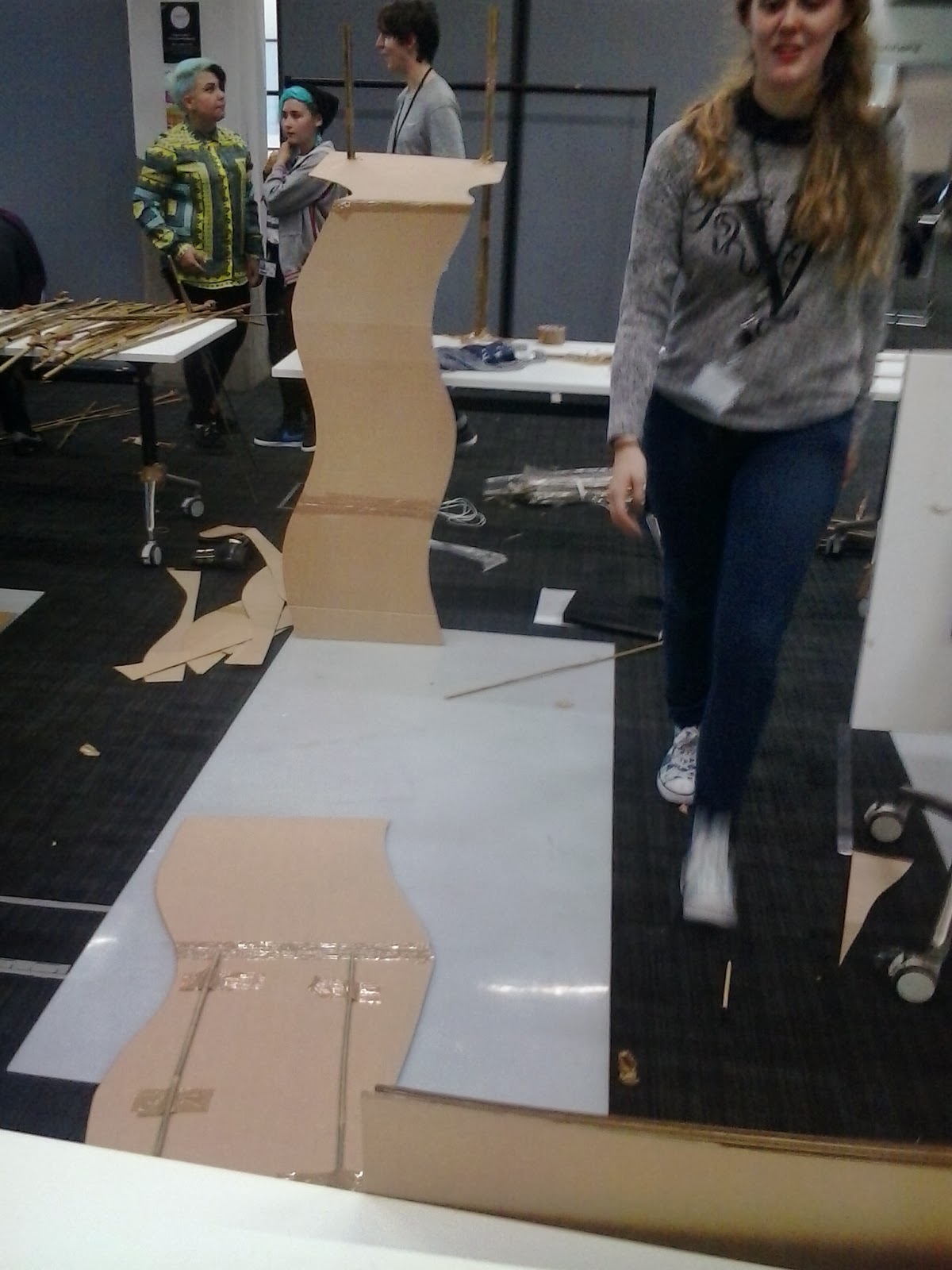


Day 1-3D design
This was the first day of 3D design which we began by doing a series of random drawings that we then had to use as the basis for the creation of several products. We began with this to try and push our designs further and to escape the conventions and formalities of previously made products. Below are two examples with a necklace on the left and an mp3 player on the right:


We then had to create a structure that would support a full bottle of water using only paper and masking tape. I misunderstood the brief and made a case for the bottle, which can be seen below, and so the structrue did not support the bottle whatsoever. However, I quite liked the result of this as the design flattened out into a bow like structure. Below are a selection of pictures of my structure using little figures to illustrate the scale and create an architectural feel:


The last part of the day involved using 4 sheets of cardboard and masking tape to create a structure that would hold our own weight. I struggled with this task initially as 3D design is not my strongest area but manage to create a backless chair like structure that actually proved able to hold my weight. I decided to embellish my structure with a sign stating 'made by Steph', a pattern using a love heart stamp and a smiley face; I wanted it to have quite a jovial, lighthearted feel.


 |
| Josa (http://josataylor.blogspot.co.uk) testing out my product |
London Fashion Weekend visit
 This sunday, I went to London Fashion Weekend and saw a catwalk show based on four trends- pretty in pink, back to nature, shape up and victoriana. I managed to get a front row seat and it was amazing to see the clothes and show in such detail. Whilst watching the show, I realised it is my career aim to have my own show one day at London Fashion Week. I took several photos during the show but also around the site and also got some photos of the models after the show. It was an awe inspiring afternoon and I will definitely be back in February! Below are digital collages made using photoshop with images taken whilst there and a short video of the catwalk :
 |
| pretty in pink |
 |
| back to nature |
 |
| shape up |
 |
| victoriana |
 |
| collage of the day |
 |
| multi trend collage |
 |
| playing about with hues on photoshop |

Friday, 20 September 2013
I.T and academic writing rotation reflective summary
I found this week possibly the most difficult of all as it was the least creatively stimulating. I also found it quite difficult to concentrate for long periods of time on computers as opposed to having actual materials to experiment with. However, I understood the importance of the different tasks and did enjoy the visit to the Tate modern. I think what I achieved was good in terms of quality however I do not feel it was my best work. I received positive feedback for things such as my poster as one student in particular thought I had managed to retain my style whilst working digitally which can sometimes be difficult. From this week, I have learnt the importance of still trying to concentrate and work hard despite not being instantly inspired by the tasks. I learnt this during the poster making on Photoshop, Illustrator and InDesign as I realised I can create work that I like if I put the effort in on learning tricks and tips for these programs. I will use these thoughts in my future work in that if I do not like what I am having to do, I should put just as much effort into it to ensure I do not have elements of my work that are weaker in quality. I think the combination of digital textures is successful in my poster as it matches the kind of work that I create by hand. I was not happy with the poster overall as I don’t think I fully pushed ideas and I kind of chose the easy route. I found this week in general quite challenging as I found concentrating on most elements of it quite difficult. The part I found easiest was writing down my initial thoughts for my review as I felt really passionate about the piece I wrote about. I think my time management and planning wasn't too bad for this week as I seemed to be on top of the tasks we had to complete. To improve the week in general, I would ask the teachers if I didn't understand something rather than ignoring it as I found in particular the Harvard referencing section of the week quite confusing.
Thursday, 19 September 2013
Tate Modern trip review: Emin's world
As a fan of both Emin and Trockel, I was eager to see the room Homeworkers in the Energy and Process collection at Tate Modern. The collection featuring the work of Emin, Trockel, Messager and Harrison is based around one theme; their work subverts materials commonly associated with feminine craft and the domestic sphere. The stand out piece of the collection has to be Emin's 'Hate and Power Can be a terrible thing', an appliqué quilt based around Margaret Thatcher and the Falklands war. The sheer size and detail of the piece commands the room and draws you in as you edge closer towards it. Powerful statements such as 'There's no one in this room who has not thought of killing' provide a discussion point as the couple next to me prove, beginning to debate this very question as they walk away. The contrast of cutesy, chintzy floral with controversial statements exemplifies exactly what Emin does best. The main theme of this piece can only be seen if you squint to read the handwritten text in the lower half of the piece; persevere and you will discover the quote 'In 1982, a year so many conscripts did not got home-because you, killed them all'. Emin is referring to Thatcher's involvement in the Falklands War and it is the placement of this emotive statement that requires inquisition into Emin's appliqué quilt. If you skim over the felt and floral, you miss the deeper point of this artist's work. An overheard comment 'it looks so happy but it's not' succinctly sums up her work in general. This piece of Emin's is in my opinion easily the best piece in the room and controversially so, the best piece in the gallery. Not only do I recommend a visit to Room 8: Homemakers, I insist on it if you want to discover and appreciate one of Britain's best female artists.
 |
| 'Hate and Power Can be a terrible thing'-Tracey Emin (author's own image) |
 |
| My version of her piece
Peer Feedback for the review:
Victoria-victoriakgeary.blogspot.com:
|
Contextual studies: Gilles and Cecilie studio lecture
This afternoon, we had Cecilie from Gilles and Cecilie studio come to speak to us about their work and industry practice. It was a really informative and enjoyable talk that provided insight into an actual working business. As I have interest in illustration, I really liked having the chance to hear from someone in the industry. She talked about a variety of different projects they had taken part in from Paul Smith to Pepsi. She also gave tips and advice to anyone thinking of a similar career such as the importance of getting a studio straight away. She also emphasised that it is crucial to promote yourself to companies and not wait to be contacted. An interesting point she made was to spend really carefully from the beginning to avoid running into money problems if commissions are low at a particular time. For example, I found out that work seems to go in waves as there are particular popular points. They currently have 12 projects on the go as September seems to be a particularly busy time. It was really inspiring to hear that a small studio manages to have as many as 12 commissions as often illustration is thought of as a risky career due to a lack of commissions. These are just some of the things I discovered in the lecture and I am really pleased we had this chance to hear from this studio.
Introduction to I.T: photoshop, illustrator and indesign
Today's session was focused on learning the beginning steps of three crucial programs in the design world. These are illustrator, indesign and photoshop. We began with photoshop and were given our brief of what to create. It had to be an A3 poster with three different elements:
1) a photo that had been edited by photoshop
2) some kind of graphic logo made on illustrator
3) body copy of 100-200 words
The subject of the poster had to revolve around the idea of memory and so we began by thinking of possible ideas we could use. I decided to look through my photos to see if that would initiate an idea. I found pictures taken from a day trip to Brighton with my friends and chose to focus on this. I selected two images to work on using photoshop. I wanted to use the image of the pier as a background and the image of myself and a friend as the main image. I also added some elements of poster I wanted to be on there which were the graph paper for the text and the mini ice lollies; they are used to imitate the use of stickers. We then moved onto illustrator and created some kind of logo or header. I decided to create my own font and used thick black connecting lines to spell out Brighton 2012. I wanted to make my own font as despite using a computer, I wanted the work to have a handmade aesthetic. The last program we used was Indesign which is used to place all elements of our poster together. I added the header logo and body copy to the piece. This stage was relatively fast as I only had to add two elements to the piece. Below is my finished A3 poster:

Overall, this day was informative however I was already familiar with all three programs. I did find out things previously unknown to me such as the difference between RGB and CMYK.
Monday, 16 September 2013
Fashion and Textiles rotation reflective summary
I think I got on really well overall with my tasks in the fashion and textiles rotation week as I really enjoyed them and tried to put my maximum effort into them. I think I did however struggle with keeping to the brief at points such as when creating the samples as I failed to fully grasp the 3D element and went for a more 2D illustrative style. I think I did however achieve quite a lot this week especially with using my illustrative style in the medium of garment making and also in the fashion collages we created on day two. I also think the variety of materials I used was successful as it allowed me to create unique work and to establish my design aesthetic even whilst adhering to a brief. I got really positive feedback about my work and people really appreciated the unusual materials such as fake grass and glitter glue. I also got constructive criticism from teaching staff in that I should try and make my work more 3D to further push my style. I found this really useful as it made me realise I need to try and pay more attention to the brief as opposed to rushing into my own style as I will learn more. From the overall tasks, I have learnt the importance of the design process in order to fully realise a piece you are happy with. I learnt this through the designing of my final garment and I will use this extensively in my future when creating work. I think the wide range of media and varied imagery that I included in my collages and also my finished garment works successfully as it draws from a range of sources that goes beyond fashion (for example the John Lennon imagery) and makes the work connect with others (such as the use of childhood favourite, glitter glue). I think the quality of some elements could have been improved for example the use of glitter for the collar as it was quite patchy and kept falling off. In hindsight, I should have prepared for this and created a stick on collar using dried glitter glue. I found the actual construction element of creating the garment quite difficult as this is something I have struggled with but I know it is about practise and not rushing the preparation. I don’t think I found elements of the week easy but I suppose the easiest part of the week was raising enthusiasm as I really enjoyed the tasks and felt quite disappointed when I realised it was the last day of the rotation. I think my time management was actually quite good for this week as I managed to finish tasks on time and even early in some cases. To improve, I would have tried to be more organised with some elements such as the photo shoot as I do not feel I produced the best shots due to a lack of planning and location finding beforehand. To learn from this, I would ensure I think about each stage of the process with the same time and care as when one element is considered less it can be seen in the results.
Sunday, 15 September 2013
Further research into Fashion & Textiles: Fashion illustration
Although this is not strictly related to the studio project we completed this week in the Fashion & Textiles rotation, I decided to explore fashion illustration a little bit as the collages I completed on day two inspired me to use my illustrative style in relation to fashion. I first created two pieces, which can be seen in the pictures below, that relate to fashion illustration:


I then found an illustrator that I really liked and wanted to use as inspiration to create some fashion illustration. Esra Roise is a freelance illustrator that I found on http://www.booooooom.com and this is her website http://www.esraroise.com. Her work possesses a very beautiful quality and uses fashion related imagery to create a twist on the idea of fashion illustration. The piece is a response to a page in this month's Company magazine and explores the trends of A/W 13. Below is the piece I created in response:


Subscribe to:
Comments (Atom)