Sunday 22 December 2013

'Live for myself. Answer to nobody'-Steve McQueen exhibition

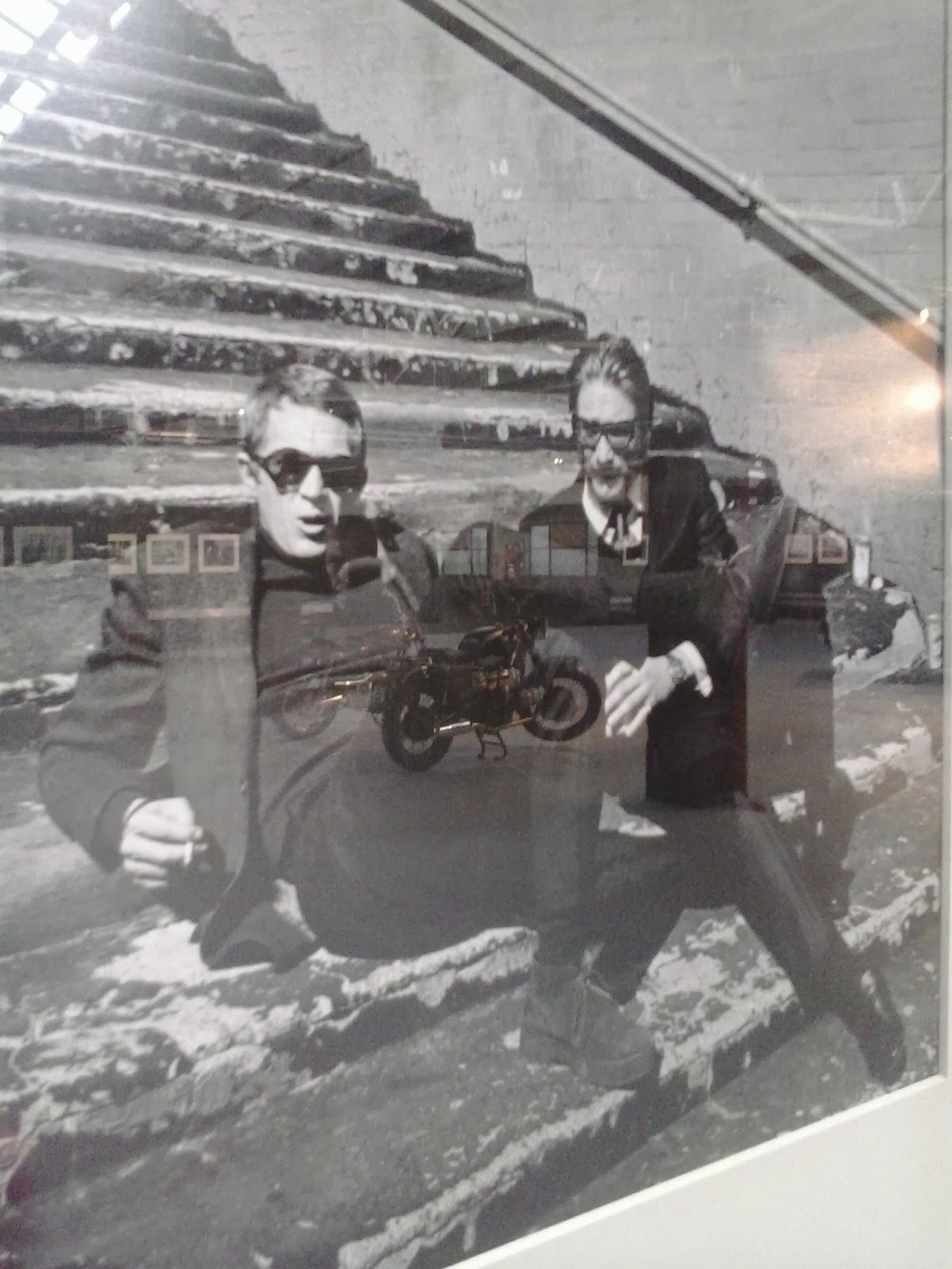
These are images taken at the 'Live for myself. Answer to nobody' exhibition based on Steve McQueen however it also featured work from several others that explored motifs that McQueen embodied such as that of the rebellious outsider.


London Lights


Sunday 1 December 2013

3 Words project-reflective summary

For this project, I think I got on really well with the given tasks as I tried really hard not to rely on the internet and thought out of the box in terms of research.  I also think I did well in terms of combining unusual words to create something unique. I think I got on well with the task in that I am a good independent worker and seemed to get a good reception towards my work. From this project, I have learnt the importance of not just relying on google for research purposes as not having that to depend means you find unusual, more interesting imagery and information. I will use this in the future in that I will try and think more laterally as opposed to trying to find the more obvious resources. I think the aesthetic I have created for this project works really well as I think it displays my personal style and enables me to have a series of projects that appear cohesive and are injected with a sense of my personality. The thing I found most challenging was at the beginning due to a lack of available resources on the boy band East 17 however I overcame this well as I found alternative resources whilst I waited for my East 17 book to arrive from Amazon. If I were to improve my project, I would work on the designing aspects and put more time into the design work.

3 Words project-East 17, Decorate and Grotesque

The project I decided to choose for these two weeks was 3 Words as it was the most design focused and seemed to be like a practise of the kind of work I will do at degree level. Instead of explaining my project in a conventional way, I have filmed a video of myself explaining my sketchbook and my project. This can be seen below:


Exhibitions this weekend-Corinne Day, Isabella Blow and Paul Smith

This weekend was quite busy in terms of exhibition visits but it was highly enjoyable. The first I went to  was the Corinne Day photography exhibition at Gimpel fills near Oxford Street and consisted of a series of the legendary nineties photographer's images. I really enjoyed this small but well considered display of her images and found them inspirational in terms of styling in the images and also her use of natural light. I then went over to Somerset House to catch the Isabella Blow exhibition which was a really great show in terms of the extent of what was on display and also the variety shown. I particularly enjoyed seeing garments from Alexander McQueen's graduate collection and also watching a catwalk video of one of his shows as this felt a real privilege to see such an icon's work. The last visit I made was on Sunday to the Design Museum to see the Paul Smith show which has to be one of the best exhibitions I have ever seen, along with a Peter Blake retrospective and this year's Pick Me Up graphic arts festival. This exhibition consisted of many different elements including a mock up of his old studio and also a workshop; this variety really allowed you to gain an insight into the mind of this not only highly talented designer but also the person himself.  I highly recommend all three shows I saw this weekend however the Paul Smith exhibition has to be the highlight of them all.

Industry style project-reflective summary

I think I got on really well with the tasks given as I threw myself into each task and made sure each step of the project was done to my satisfaction. I think what we created as a group was successful and I think we captured the essence of J.W Anderson's aesthetic in our project. The biggest issues in our project was group work in that there were breakdowns of communication and also some group members did not put in as much effort as others. From this I learnt the importance of having a team that are all as engaged as each other as it causes resentment and issues within the group. I felt it was quite unfair that due to group members slacking it resulted in myself taking on double the work however I wish I had sorted it out earlier to ensure I could have put more time into my design work. The most challenging thing I have faced in this project has to be the group work itself and not the actual creating. The work itself I really enjoyed and found quite natural to do especially the styling for the photo shoot which has to be a highlight of the project. In terms of my design work, I am relatively pleased with my final designs however I wish I had spent less time on promotion duties and making the presentation; this would have enabled me to develop my designs further. I think in terms of planning and management skills I did really well as I kind of took on the unofficial role of group manager which meant keeping everything in order and checking everybody had completed tasks on schedule with our planning. In order to improve in the future, I would have sorted out any group issues earlier so everyone was made to pull their weight more.

Industry style project-J.W Anderson

This project was about taking a famous design house and working in groups to have complete creative control of one collection, ours being a/w 15 at J.W Anderson. I decided to be in charge of menswear as this is the area I want to go into in the future. We began the first day by getting into our groups and coming up with our concept based on two quotes we had been given and also discussing what J.W Anderson's aesthetic and design ethos was. We discovered he likes to reject the notions of gender in terms of design and making garments that he likes as oppose to what is deemed appropriate for men. Our group chose the first quote which involved words like broken and essay however it was the word traveller which initiated my idea of using travel but in and around London hence my name choice of our collection, Concrete Traveller. In terms of the colour scheme, we decided to use greys resembling the concrete but with flashes of colour that emulates the neon shop fronts and traffic lights that punctuate London streets. We created a group concept board which can be seen to the right including other motifs we chose to include such as that of safaris and maps. I chose to use elements of the safari style jacket in my designs without referencing it explicitly as I wanted the designs to be dissimilar from what has already been seen before.  The use of maps was incorporated within Rosie's patterns along with the use of animal prints but using British and London based animals along with ones found in Africa. My random suggestion of including animals such as pigeons turned out to be quite a strong idea that became a symbol of our collection. After creating our group concept board, everybody moved onto their individual research and so I created an individual concept board for my designs.  I first found images of J.W Anderson's menswear so I could get a sense of his aesthetic in order for our collection to look cohesive with his previous collections. My concept board uses found imagery but the majority of London shots were my own as I frequently take images of things that inspire me in my hometown. I also included a few of my favourite images from the designer's menswear collections  and also some images of bands that inspire me in terms of style as they do not confine themselves to menswear but draw influence from glam rock and the peacock revolution.


I also decided to place Rosie's prints onto a picture of the designer himself and garments from his previous collections in order to see how they would work with the designs myself and Yasmin (the womenswear designer) had created.


I then did a selection of rough design ideas and further developed them in my sketchbook which lead to my final designs that I then added Rosie's prints to, I also added the prints to Yasmin's final designs as she was unable to do so. Before completing my final designs, I handmade a piece which was inspired by the designs I had already done. Images of this can be seen below:


My final designs with the pattern can be seen below on the mockup of our catwalk which also features my illustrations of the crowd which Sherlaine then enhanced on photoshop:


Along with my design duties, I also took a role in the promotion tasks due to group issues meaning I had to balance both tasks. We decided to give a gift bag out in our presentation, mirroring that which happens at fashion shows, which was actually quite laborious in terms of organisation. We wanted to use brown paper bags which were reminiscent of childhood trips to the sweet shop and so we ordered these from amazon. We also wanted to use luggage tags for our invitations and so we ordered card versions also from amazon however disappointingly these did not arrive in time to be used. The items within the gift bag were sourced by myself and Lewis from the 99p store and these were sweets, crayons, hairbands and fake money. We wanted the bags to humorous and lighthearted with a theme of survival running through, hence the inclusion of the survival guide to London Fashion Week designed by myself and Lewis. The most time consuming part of the gift bags was the filling of them and ensuring they were all equal in their contents. We all (but two group members) came together on this task in order to ensure they were finished in time. 


As part of the lookbook that Lewis and Sherlaine created we also included a photo shoot that Iona and Lewis modelled in, that myself and Lewis styled using a mix of our clothes, Sherlaine did the makeup for and Shanice took the photographs. These images can be seen below and we were really happy with the results in terms of styling as they were really in keeping with the aesthetic of J .W Anderson and provided inspiration for my designs.


Iona's accessory designs:


Rosie's patterns: