I have really enjoyed the exploratory stage as a whole as it has been a good chance to try out pathways that I have previously touched on as part of my education. The pathway I enjoyed most has to be Fashion and Textiles as I relished the chance for creative freedom and found the process from sample to the photo shoot of the garment the most satisfying. It made it easier to understand the journey designers go on and felt like a good taster of what would be to come if you chose that pathway-I have decided to choose this pathway for a number of reasons. I did however enjoy different elements of all the rotations such as the unexpected nature of 3D and the chance to fully test out what we had made. In the graphics pathway, I found the creation of typography interesting as you can create letters from the most unlikely of experiments. The lens based media rotation made me realise the importance of a story and it was fun developing a story in groups and hearing what others had created. If I were to complete the exploratory stage again, I would try to be even more experimental in the rotations that I wasn't immediately drawn to as this is an experience I won't really get again. I am however pleased with the work I created over the time and I am also glad of the student blog, despite it feeling a chore at times, as it allows me to go back and see the moments that already feel a long time ago.
It features my work and experimentation during the foundation year at Ravensbourne.
Monday, 21 October 2013
Sunday, 20 October 2013
Two exhibitions I went to this weekend-Brutal and ICA Off-Site
This is just a quick post about two exhibitions I went to this weekend whilst taking a break from getting ready for assessment. I didn't take any pictures due to recent camera issues but instead just tried to enjoy the exhibition in the moment. The first exhibition I went to was on Friday evening and was at the 180 strand, a large dilapidated building that was absolutely perfect as a backdrop for the work. The exhibition was called Brutal(http://www.lazinc.com/brutal/booking) and was meant to put viewers on edge and re imagine the gallery as a setting for art. It began with a performance piece of three gas mask wearing boys with baseball bats and metal poles which immediately heightened your awareness. You then followed them to the main gallery space and down stairs to a labyrinth style expanse with dark lighting, dripping sounds and deliberately frightening work. It was one of the best exhibitions I have ever been to and I would highly recommend it- I will probably go back to take photographs as I can foresee the aesthetics of both the building and the artwork providing influence in the future The second exhibition I went to was on Saturday and I had been meaning to go for a long time. It was the ICA Off-Site: A Journey Through London Subculture: 1980's to Now (http://www.ica.org.uk/?lid=38334) and included work from some of my favourite designers, Giles Deacon, Julie Verhoeven and Meadham Kirchoff. Although more typical in it's method of displaying compared to Brutal, it was still a really interesting visit and I am definitely glad I caught the exhibition in time.
Sunday, 13 October 2013
Lens Based Media rotation reflective summary
I think I got on well with the tasks I was given as I tried to put effort into each task and thought carefully about what I would create. I am quite pleased with what I have achieved on the whole especially the drawing from one of the images from memories in my environment. I also like the pictures I took which were inspired by a selection of words including happy, sad and echo. I was less pleased with the storytelling element of the work I made as I don't think it was as strong as the visual elements of the work I created. I got positive feedback about my work and this helped as it is a nice feeling to know that other people appreciate the work you make. I have learnt from the overall tasks that the story is just as important as the visual result and that goes for all pathways not just lens based media. I learnt this during the rotation in general as it was very heavily story based and I will use this in my future work whatever I create as it gives the work more depth. I think the work I created was successful in that I still managed to retain my style such as through the inclusion of dinosaurs in my story as this is a motif that has ran throughout my work in the other rotations. I was not happy with the story telling elements of my work as I think I could have put more time into creating more original and well developed stories as opposed to referring back to common stories that have been recreated several times. I don't think I found any elements of this rotation particularly easy as I am not used to the camera being my main focus (excuse the pun) rather it being an accompaniment to my mixed media style. My time management could have been improved in that I should have spent more time considering the shots as opposed to rushing into shooting. I will learn from this in that the planning is crucial to the final result no matter what you are creating.
Contextual Studies: Katy Lassen lecture
This lecture from stylist Katie Lassen was by far the most inspirational and interesting talk we have had in my opinion as she gave us a really good insight into her world and her path to where she is now. She started by discussing a stylist's role and their power in a career such as that of a musician, using Lana Del Rey as an example. Raising an interesting point in that fashion stories are at the core advertisements for the brands, it adds another angle to whether fashion can be art. It was interesting that editorials which stylists are involved in are rarely paid for but rather the team will financially back it in order to gain portfolio work which in turn books them commercial, paid work. Katie Lassen also discussed the role of others in the career of a stylist such as that of agents. She discussed their role in looking after the production of shoots and the promotion of your work in order for a cut. It was also interesting to hear that you will be regarded higher if you are signed to a creative agency as it provides some kind of validation to your work in a crowded market. The biggest British agencies are apparently CLM, streeters, Art & Commerce, MAP and DAV and we also found out about the difference of Milan agencies in relation to London. It seems there is a far more conservative and old school aesthetic to Milan and so most agencies reflect this however 2DM Management, the agency Katy Lassen is signed to, has an edgier, more fashion forward feel. In terms of others in your career, it was stressed the importance of creating a team around you of hairdressers/photographers/ makeup artists etc which enables you to be booked as a group that can recreate a certain aesthetic. The importance of experience was also stressed as this is the way into the fashion industry as either an intern, fashion assistant or shadowing people in the profession you are interested in. Although it is often unpaid, there really is no alternative as there will always be others willing to work for nothing. She also revealed that in terms of Conde Nast, a magazine publisher, once you have one placement it is much easier to find others within the magazines housed there. However, there is no point taking on an internship unless you are ready to work incredibly hard and prove your capabilities to the people working around you. I liked that the lecturer gave us a list of people to look up if we were interested in styling and fashion-these are:
- Katie Grand
- Grace Coddington
- Melanie Ward
- Edward Enninful
- Nicola Formichetti
- Katy England
- David Bradshaw
Katy Lassen is currently freelance and discussed the benefits of this as opposed to being hired somewhere specific. She stated that although you have less security, you are able to be your own boss and have a varying aesthetic as it ranges from indie titles to big commercial jobs. Lassen also stressed the importance of an having an online presence either a website, blog, twitter account or others in order to promote yourself. Her last tips from the lecture were to:
- constantly collect a visual library that includes more than that of fashion imagery
- educate yourself
- network with others
- be determined but nice to the people you work with
- develop your own point of view and unique aesthetic
Day 3-Lens Based Media
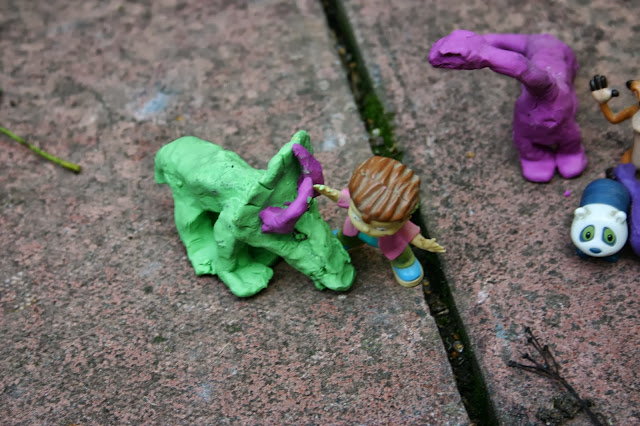
Today was based on creating a finished storyboard of the images we took on our self directed study day. The first set of images is a love story about two dinosaurs but the struggle is the inclusion of the rugrats toy who is already with one of the dinosaurs. The green dinosaur overcomes this however by fighting with the rugrats toy for the love of the purple dinosuar.
 |
| the green dinosaur is sad as he doesnt really have any friends |
 |
| he spots some potential friends and falls in love at first sight with the purple dinosaur |
 |
| the rugrats toy starts a fight with the green dinosaur as he feels threatened that he will take his girlfriend |
 |
| she steps in as she quite fancies the green dinosaur and is fed of the rugrat toy's laddish behaviour |
 |
| the green dinosaur uses his dinosaur strength and pushes him to the ground |
 |
| the dinosaurs go off happily ever after-that is until extinction... |
After talking to my peers about my story, I decided to change it into a story about friendship rather than the more common love story just by rearranging the same six images.
 |
| the rugrat toy is fighting with the green dinosaur as he doesn't want him in the friend group |
 |
| the purple dinosaur steps in as she rather quite likes him |
 |
| the green dinosaur uses his dinosaur strength to push the rugrats toy over |
 |
| the green and purple dinosaurs can still be friends and enjoy a moment together |
 |
| however the rugrat toy steps in after he has regained his strength and uses his manly charms to get the purple dinosaur back on his side |
 |
| the green dinosaur is sad and resigns himself to a life of depression, daytime tv and dinosaur dating sites |
-liked the way I have used the background to my advantage in my images
-liked that I made the dinosaurs myself as it has more of a personal feel
-liked that the characters are fantasy but the core story is relatable to humans
-clear and easy to understand
The next step of the day was to work together to create a story together based on someone's story board. We didn't choose mine but chose one of my peers' story. I do not have the images myself but the story went like this:
-a woman is in a war torn Dubai and is rescued by a soldier
-he brings her over on a plane to live in London
-she has her dream house bought for her and is finally not isolated however she has to deal with the culture changes and language barriers
-she then marries the man that rescued her whilst heavily pregnant
-she rushes to the hospital as her waters break on the day, whilst her husband follows in a car behind but he crashes and passes away
-she gives birth to twins and realises she will never be lonely as the babies are a part of him
The critique of our story was positive on the whole as the class felt it was a well thought out story that had potential to be developed. However, once we discussed it further we realised the portrayal of the protaganist was somewhat stereotypical in the gender roles as she is passive and rescued by a man. If this story were to be pursued, we were instructed to consider this and try and present the female in a stronger light.
Day 2-Lens Based Media
Today was all about character development and creating stories in a group. In the morning we watched a few short films, including Fridge, and discussed the key components of a good story. We realised that within the beginning, middle and end there needs to be a struggle and a resolution. We completed a series of different tasks today to reach the point of creating story boards which can be seen in this post.
 |
| these are six characters i created based on people I have come across in my life |
 |
| these are some characters created by my group |
 |
| these are 12 characters we developed as a group |
 |
| a shot of our working space featuring the a1 collaborative development sheet |
 |
| these are the four characters we chose to develop |
 |
| we then had to develop a story including a struggle and a solution for each character |
 |
 |
 |
| this is the group storyboard page we created and features two of the stories which include rupert the dinosaur at the top and the cass art dream guy in the middle and their stories |
This is a video of a group stop frame animation we created:
Lens Based Media-Creating a fanzine style display for my photographs
 After taking my photographs for Monday on the Lens Based Media pathway, I decided to take some photographs in my room on a Sunday afternoon( I have also presented my photographs for memories in our environment in a book format which can be seen below). The subject ranges from toys collected from Kinder eggs to my dog and I then decided I wanted to present them in a fanzine/collage style booklet which you can see in the images below:
Monday, 7 October 2013
Day 1-Lens Based Media
Today began with a powerpoint about what this pathway would involve and it was interesting to see all the avenues it could lead to, however I am sure that I will be choosing the fashion and textiles pathway. We then had a presentation about the power of the lens and learnt about the origins of the camera from Galileo's telescope to Camera Obscura techniques. I found interesting the discussion of the camera's function as a protector of moments and memories as it captures a point in time forever unlike our fading memories. After this, we had to choose one image of the pictures we had taken to recreate on A1 paper. I chose the image of the fashion show crowd as we had one hour to complete the piece and I wanted to set myself a challenge. The image itself is below and so is the drawing. We also had to complete an exercise in cropping the image to reshape the meaning and the content which I have also done. I decided to use cropping to shape the relations between the crowd members as with each cropped image, everyone appears to be with different people.
 |
| another little study I did at home from the image |
We then had to take pictures around Greenwich Peninsula based on several words which are listed under the images below:
 |
| Sad |
 |
| Echo |
 |
| Echo |
 |
| Fall |
 |
| Crush |
 |
| Jump |
 |
| Sad |
 |
| Happy |
Subscribe to:
Comments (Atom)


